Billie Blossom - Relic, Rest, Grow zines
- Mar 13, 2021
- 5 min read
Updated: Mar 24, 2021
Billie Blossom is a 27 year old photographer based in London. They specialise in analogue photography and traditional darkroom techniques, which is why I decided to research them.

I bought 3 of their photo zines - Grow, Relic, and Rest - so I can get a better understanding of their work. All of Blossom's zines are printed on uncoated matte paper, and hand stitched with coloured thread. I really like the abstract quality of the covers with the small title centralised at the top of the page, as I think it sets the tone for the rest of the zine.
Rest
According to Blossom's Patreon page, the photographs for this zine were taken on a mix of colour positive slide film and colour 35mm. The photographs take the viewer through a quiet church graveyard, while the text describes the struggle felt by many as Autumn approached this year.
I like the limited colour palette of green, black, pink, white, and orange. Blossom overlays their images over each other to create interesting compositions and borders, which I really like the look of. I'd like to experiment with this when I get access to InDesign and Photoshop. The image underneath tends to be darker than the top one, which creates interesting contrast, drawing the viewers eyes in towards the top image. Most of the pages are filled with a large image on a white background, with a thin black border left over from scanning the frames in. This isn't a conventional thing to do when presenting photographs, but I actually really like it. Doing this creates space between the photo and the page, and I think it works really well. I've seen this in a couple of my own colour 35mm photos (examples below), but I had never considered leaving the frame in on purpose before.


I think leaving in imperfections is really effective and reminds the viewer of the medium used, as well as the care and consideration that goes into making the zine, from shooting, to developing, to scanning, collating, and printing the final zine. I really love seeing evidence of analogue processes in a final piece, and I can tell Blossom does too. There are also pieces of dust and marks on the images, which make the entire feel more handmade and whole.


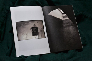
Relic
I think this is my favourite of the 3 zines I purchased because of how the writing and photographs influence each other. The writing describes Blossom's venture through a seemingly abandoned house, documenting what the single resident tells them about the house. I really love how it's written, as if the story is being retold to a friend.
Blossom starts the zine with a double page spread of black and white 35mm photographs of a doorway, a pile of various forgotten items, and a framed painting buried under an empty frame and hidden in shadow. I love the way they capture light and dark, especially in what I assume to be quite a dark environment. Leaving the dust from the scans in the final print brings the viewer further into the story, as it reflects the dust settling in the cold, damp house, and reminds them of the care put into creating the zine.
Blossom has made some considerate choices when it comes to portraying the Gregorian house accurately, while still being true to their personal style. This shows in the choice to shoot on black and white film, the choice to keep in dust marks from scanning, and the choice of thread and paper; even the time of day and weather seem to contribute to the atmosphere of the piece as a whole.
There's a careful balance of photography and descriptive writing, and this creates a really nice flow throughout the zine. This is definitely something I'm aiming for in my own work, as I'd like to work on my layout and writing skills. The text is mostly in uniform chunks, every side equidistant from the edge of the page, and I think this consistent pattern helps focus the zine on the story. Contrary to Rest, this issue has a simple presentation, and this stripped-back feel really suits the theme and narrative. The text includes dialogue, as well as descriptions of what Blossom saw while shooting.
When I read the Patreon post about the creation of this zine, I saw a paragraph that reminded me of the motivation behind my own project concept:
"With a lot of the places I visit, they're secretive in the way that they're just not known about - but anyone could go in, if they stumbled across the place, and had the inclination to. They're there, waiting. This place isn't like that. I've been the one waiting."
I think this reminded me of my own project because while my grandparents have been around far longer than I have, I haven't learned about all those years that they existed before I did. Their stories have been there, waiting for me to ask the right questions to uncover them.


Grow
This zine describes Blossom's personal growth, with colour 35mm photos of a peaceful greenhouse to accompany the text. There are scans of herbs and flowers throughout the pages, and I really really love the way this is done. It breaks up the blocky pattern of photos and text with organic shapes, linking again to the theme of the issue. I think adding unconventional shapes is a really good way to keep the flow of the zine going and I feel it encourages the viewer to stop and admire each page as it comes. I like the idea of bringing more 3D elements into the piece, and I'd love to do it in my own work. My grandma used to send cards with intricate quilling designs on them, and I think this would be a great way to both incorporate physical objects into a 2D medium, as well as allowing her creativity to live on through her grandson's work.
The text placement in this zine is more experimental and poetic than the previous twov, as it wraps around scans of flowers and cascades down the page over a faint double exposure photograph. I think that experimenting with things like this is really important and it adds a touch of artistry to the zine that hasn't necessarily been present in the others.


I'm very glad I bought these zines, and I think they will help me to think more about the final presentation of my work. They have inspired me to think more about what writing I could include in my zine (if that ends up being my final outcome), as well as what I could include alongside my photography. Although I didn't expect it, Blossom's zines helped me to understand my FMP theme too, even though I was looking at them for the layout. While there are some elements that I don't think I'll use in my work, I have gained a lot of inspiration from reviewing these zines. I'm glad I chose to pick up physical copies, as they are so much more impactful as a tangible object as opposed to a PDF file. I will be using these zines as a reference point throughout my outcome realisation and using them as a reminder of the level of quality I want to achieve.


Comments