Colour Darkroom Session
- May 5, 2021
- 3 min read
The colour darkroom essentially works the same way as the black and white one, except there's no red safety light and each enlarger is in its own blacked out booth. The enlargers work with 3 coloured bulbs; cyan, yellow, and magenta. Their default setting is 0 70 70, and this is what I started with for my first experiments, which were colour photograms.
I began with flowers and fabric, which gave me these images:


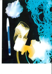


The first one used the default colour settings, f/8, and was exposed for 6 seconds. The second used the same settings, and I really like the tiny petals in the bottom right corner. For the 3rd photogram, I wanted to achieve a wider range of colours, so I put in some red wool, a blue latex glove and an orange biro, which made some really cool refractions. The next photogram was done at f/11, and I rolled up some blank film which I think looks really interesting, and I love the depth it created. I included some of my grandparents old negatives and slide film in the next photogram, as well as two glass prisms, and I'm very happy with how it turned out. I used the pen to hold a negative strip of my dad as a baby, and I like how you can see the end of one of the images. I did the same sort of thing for the next one, but with a different composition.
I then used one of Maddy's spare negatives to do a density step wedge, at 5 second intervals and an aperture of f/11.


Using this, I did a full print for 12 seconds.


Then, I took some of my own colour negatives and did another density step wedge of my negatives at f/8.


It came out too dark, so I tried it again at f/11.


Then I picked a negative and did another density step wedge, with 5 second intervals and an aperture of f/11.


Unfortunately I knocked the paper, and I hadn't closed the paper box properly after the contact sheet which caused a red fog at the top.
With Maddy's advice, I did a full print at f/11 for 15 seconds, which came out very dark.


I redid the print for 10 seconds, which gave me a much better exposure, but it was very cyan.


To fix the colour, I looked at the following colour chart, and decided to reduce magenta and yellow by 20 each, using the dials on the enlarger.


This gave me a much better colour, but the woman and her dog were underexposed, while the background had a pretty good exposure.


To remedy this, I dodged them with my hand while exposing the image, but I knocked the paper.


It looks interesting, but I wanted to get a clean image so I tried again. Sadly I had changed the exposure to 5.6 to refocus it and forgotten to change it back, so it came out completely dark.


I tried again, and this time I made a little dodging tool out of used paper. Using this meant I could more accurately dodge a specific silhouette, instead of doing it roughly with my hand.


Here's what that looked like, with the right aperture of f/11:


This was my final print of the day, and I'm very satisfied with it. I think it's still a little bit too yellow, but this also makes a nice atmosphere. I really love the rough edges as I think it adds a nice border, and reminds the viewer of the processes that have been gone through to achieve the final print.
I'm very glad I had this darkroom session and I look forward to using it more in the future. However, I don't think I'll be using it for my FMP because of how long-winded the process is, and I also kind of hate the glossy paper. I'll still try to use it for my personal projects though.


Comments